A programmer's Moonlander review
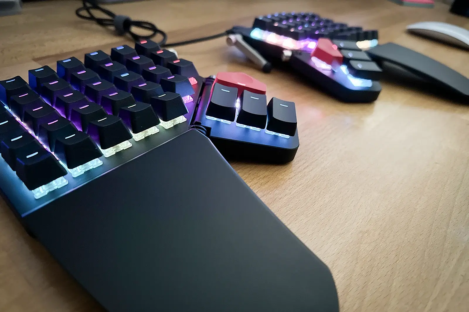
Okay, okay, another ZSA Moonlander review, big whoop. Many posts and videos are out there discussing the pros and cons of the board, and you may be reading this alongside those as you contemplate a purchase (they're spendy boards). My review will differ from all the others because I'm focusing on something unique: me!
Rather than write a post that helps you compare the Moonlander against other clicky-clacky options, I thought I'd describe myself and what I wanted to accomplish in purchasing a fancy-schmancy keyboard. That way, if you're a little like me, you might find yourself with a new daily driver. Alternatively, if I sound lame and you can't relate to a grown man writing a blog post (in 2024) about a keyboard that helps him type characters on a screen faster, I understand. I take absolutely no offense. I am lame, but I'm lame with a keyboard that can play music and has pretty lights.
About me
I work on computers a lot. Like not on the machines themselves, I create things using computers. It's pretty much the only thing I've done since graduating college long ago. You can think of me as a designer/developer combo. I write a lot of code and spend a reasonable amount of time in design software. Design something and make it come to life. That's the gist. Now, let's move on to some bullet points centered around keyboard usage.
- Touch typing - Absolutely. I am a boring person who follows the rules, which means I have excellent typing skills. All my keystrokes are made with the correct fingers—no bad habits, including going up into the numbers row or the number pad. I warned you that I might sound lame.
- QWERTY - Yes. I came from a full-sized Apple Magic Keyboard, and that's the only style of keyboard I've typed on for as long as I can remember.
- Ergonomic issues - Thankfully, I've never received much in the way of repetitive stress injuries (RSI). I even use the Magic Mouse!
- Computer setup - I have a MacBook Pro hooked up to dual Studio Displays and spend most of my time at my desk. I like to roam a little with the laptop, but it's docked and connected 90% of the time.
- Body type - I suppose I'm considered a large human at 6' 3", 235 lbs. It's not Jack Reacher big, but I played linebacker and enjoyed hitting people for a good chunk of my life. I wear either XL or XXL gloves, depending on the brand.
- Typing speed - on websites like keybr.com, I average around 85 wpm with high 90s accuracy. It's by no means blazing, but I also don't do that sort of typing very often. I'm mostly writing code, which is a different beast altogether.
- Mechanical keyboards - No experience aside from pre-membrane days when that's generally what you got with your machine.
- Programming languages - Most frequently used are Ruby, JavaScript, HTML, CSS/Sass, and... Swift (more on this next).
Huh? Why are you changing keyboards?
After perusing those bullet points, you might wonder why I'd dump a few hundred dollars on a keyboard, given I'm a proficient typist, without a need to improve ergonomics and no particular affinity to the mechanical keyboard universe. It's a fair question, and the answer is efficiency.
For the last several months, I have been getting into iOS development. This has meant learning a new programming language, Swift. Along with Swift has come the declarative framework SwiftUI. On top of that, you can add Xcode and all the new key bindings for that application. I felt....so.....slow. Coming from Ruby, I was getting annoyed by all the curly braces I had to type. SwiftUI had me arrowing around like crazy as I extracted and embedded views inside one another. Xcode's autocompletion was really messing me up with the variety of options it presents. I wanted calmer fingers that didn't have to dance across the keyboard all day long and constantly leave the home row.
I needed a programmable keyboard tailored to my specific needs to be more efficient in my movements. It's that simple. I hated all the wasted motion and set out to see if there was a better way.
Settling on the Moonlander
It's important to note that I had no desire to go down the mechanical keyboard rabbit hole. I just wanted a better tool than what I had, with the lowest possible learning curve. I was willing to gamble that I'd adapt to the physical differences between the old and new board, but I didn't want to devote a single brain cell to the software side of things. The overwhelming praise for Oryx, ZSA's key mapping software, sold me after reading only a few reviews. Even people who settled on different brands wished they could take advantage of ZSA's software. This was enough for me to zero in on the Moonlander almost immediately.
Once I was done considering other options, I had to make the final decision of whether it was going to be worth it to shell out close to $400 for a keyboard. My outstanding considerations were:
- Should I switch keyboard layouts? Colemak (DH), perhaps?
- Would the columnar keys be challenging to switch to?
- Black vs white? It's a super dumb thing to worry about, but come on... you're trying to decide, too.
- Will I be annoyed by cords crossing my desk after having cordless peripherals for so long?
- Blank or printed keycaps?
- Would I miss Touch ID?
I couldn't see any dealbreakers on that list. The issues were either cosmetic or not directly tied to the keyboard. E.g., I could switch to Colemak on any keyboard, so it shouldn't affect my decision to purchase the Moonlander.
So, I clicked "Buy Now."
Order and shipping time
I ordered a black Moonlander Mark I with Cherry MX Brown switches and blank keycaps on January 1st, 2024. It arrived on my doorstep on January 9th for a total of eight days. It felt much longer 😂. If this were a typical review, I would discuss unboxing, build quality, initial impressions, etc., but plenty of those reviews are out there. I will stay focused on whether or not the board helped me type more efficiently.
The transition
This is the scary part, right? You've read other reviews mentioning weeks or months before they reached typing parity with their old keyboard. That's a rough proposition if you are expected to produce work during that period. It's okay; you can take a breath. It might be better than you're thinking.
First things first, I switched cold turkey. I left my old keyboard on my desk to reference symbol locations, but I never went back to it in a moment of desperation.
I decided to stay with QWERTY. Once again, I don't have any RSI issues and folks are typing at 200+ words per minute using QWERTY, so I didn't see the advantage for me making a layout switch. I was also concerned about transitioning between the keyboards on my laptop, phone, and other folk's machines. This was probably the wisest decision I made during the transition, as it allowed me to be proficient in just a couple of days (not weeks or months). I feel justified in saying this because I could accurately type all the letters almost immediately except for the letter C.
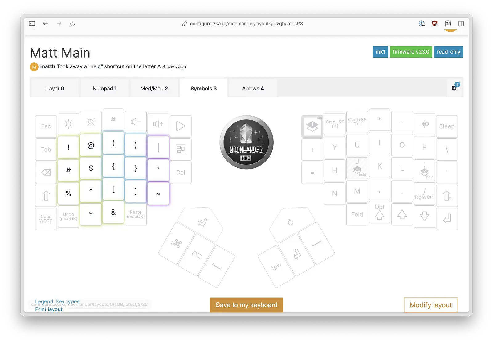
Conversely, I moved all the symbols to a layer and off the number row, which slowed me down considerably. When you're writing code, you use a lot of symbols! I can't imagine how slow I would have been with a remapping of the letters, too. I should mention that the "numbers row" on the Moonlander is a reach. I have big hands and must lift my palms off the rests to strike those keys. Those extra movements are the primary thing I wanted to eliminate, and thus, the need for a symbols layer. I'll talk more about layers in a bit.
The columnar layout was fine. I've always used the number pad a lot (which uses columns), so my brain and right hand had a pretty easy time with the transition. My left hand was mostly fine, but as I mentioned before, I struggled with the C key because I wanted to reach down diagonally. But since that was the only finger I struggled with, I could concentrate on it and got it corrected relatively quickly. I was averaging 46 wpm by the second day, mostly slowed down by unfamiliarity with the symbols layer.
The travel distance of each keypress did take some getting used to. The keys on a membrane keyboard are quicker to press, and I had to be more careful to get my finger in the center of each key to avoid striking an adjacent one.
I was prepared to miss Touch ID from my old keyboard. I have an Apple Watch, which allows you to log into your machine or apps like 1Password. Using the watch is slower, but it certainly saves me from having to make a goofy mount for the other keyboard for the sole purpose of Touch ID. It would be awesome if Apple would release a standalone button.
Having chords on the desk isn't that big of a deal. I don't keep much between the keyboard and monitor, so the chords aren't obstructing anything.
I'm purposefully leaving the layout section and my strategy until the end because it will be highly personal to you and the applications you spend time in. That being said, I will summarize the transition as "not too bad." Most reviews and comments I read prepared me for something far worse. I only had one moment of weakness (day six) when I was getting frustrated with keyboard shortcuts in applications I use less often and thought I might switch back to my old keyboard. Most people will find keyboard shortcuts that combine multiple keys to be difficult to relearn. I solved some of these issues by simply mapping the functionality to unused keys for a single-stroke solution.
If you have good typing technique and aren't planning on an alternative keyboard layout, you'll have a smooth transition to the Moonlander. Notice I haven't even brought up the split keyboard or tenting because I didn't feel like it factored into the learning curve. I initially started with the board flat, like they recommended, and it felt good. I have since opted for a slight tent because I feel like my thumbs can better feel the difference between the first and second piano keys. Ultimately, the transition was far easier than I had been led to believe.
There and back again
Let's face it: a new keyboard will not be the last keyboard you ever type on. You'll occasionally find yourself pecking away on a traditional keyboard again. I undocked my laptop a couple of weeks after transitioning to the Moonlander to see what the built-in keyboard would feel like. Ironically, my fingers had more difficulty transitioning back to the staggered layout than going in the opposite direction. I actually chuckled to myself because my brain and muscle memory were in conflict, causing my fingers to sort of contort and freeze. After a few minutes, things settled down, and I could serviceably type using a "regular" keyboard.
I predict my brain will kiss most keyboard shortcuts goodbye on a regular keyboard. I've either fundamentally changed (improved) them on the Moonlander or will lose them from lack of use. Given how infrequently I'll be on alternative keyboards, I'm more than willing to make that sacrifice.
Bottom line: Your gains on the Moonlander should outweigh any speed losses on a traditional keyboard.
Layout
I did not think the keyboard layout would be a very controversial part of this process. I figured there would be some generally agreed-upon layouts for people who write code, which I would adopt with a couple of customizations. I was wrong about this. Your layout is going to be extremely personal.
Given this error in judgment, I felt lucky I decided on blank keycaps. I made the decision out of laziness because I didn't want to move the keycaps around when I made adjustments in Oryx, but it proved to be a godsend once I realized how many tweaks I'd be making. If you're on the fence regarding blank keycaps, I'd strongly suggest checking out Keymapp, which was recently released by ZSA. It may be the life preserver you need to survive the initial transition.
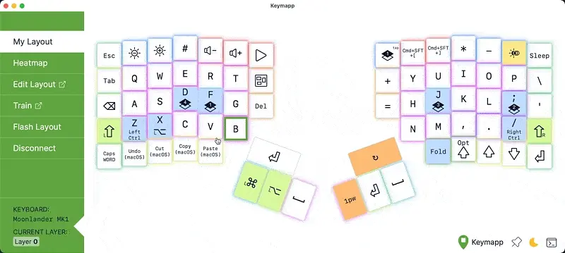
Keymapp is a live view of your layout. There's no longer a need to print out your layers and hang them up around your desk to use as references. I just toss it up on a secondary monitor to take a peek at whenever I forget where I put a particular key. In my opinion, Keymapp eliminates the need for printed keys. It's arguably better because it only shows what is on the active layer, which the physical board can't do. They introduced Keymapp in November of 2023, and I genuinely feel bad for people making their transitions prior to it being available. It's unbelievably helpful, and I imagine many people would have had faster transitions with it.
Lights
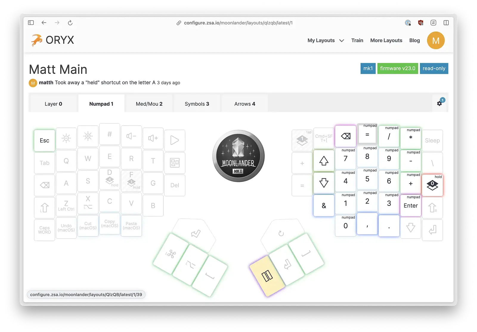
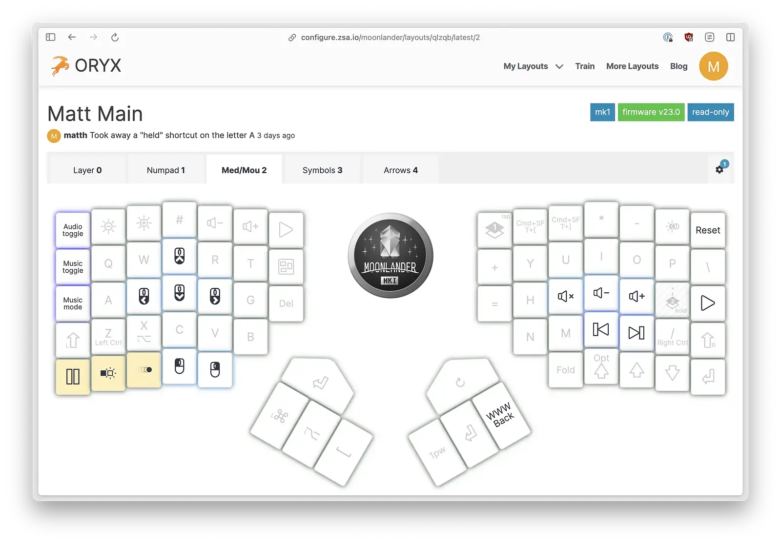
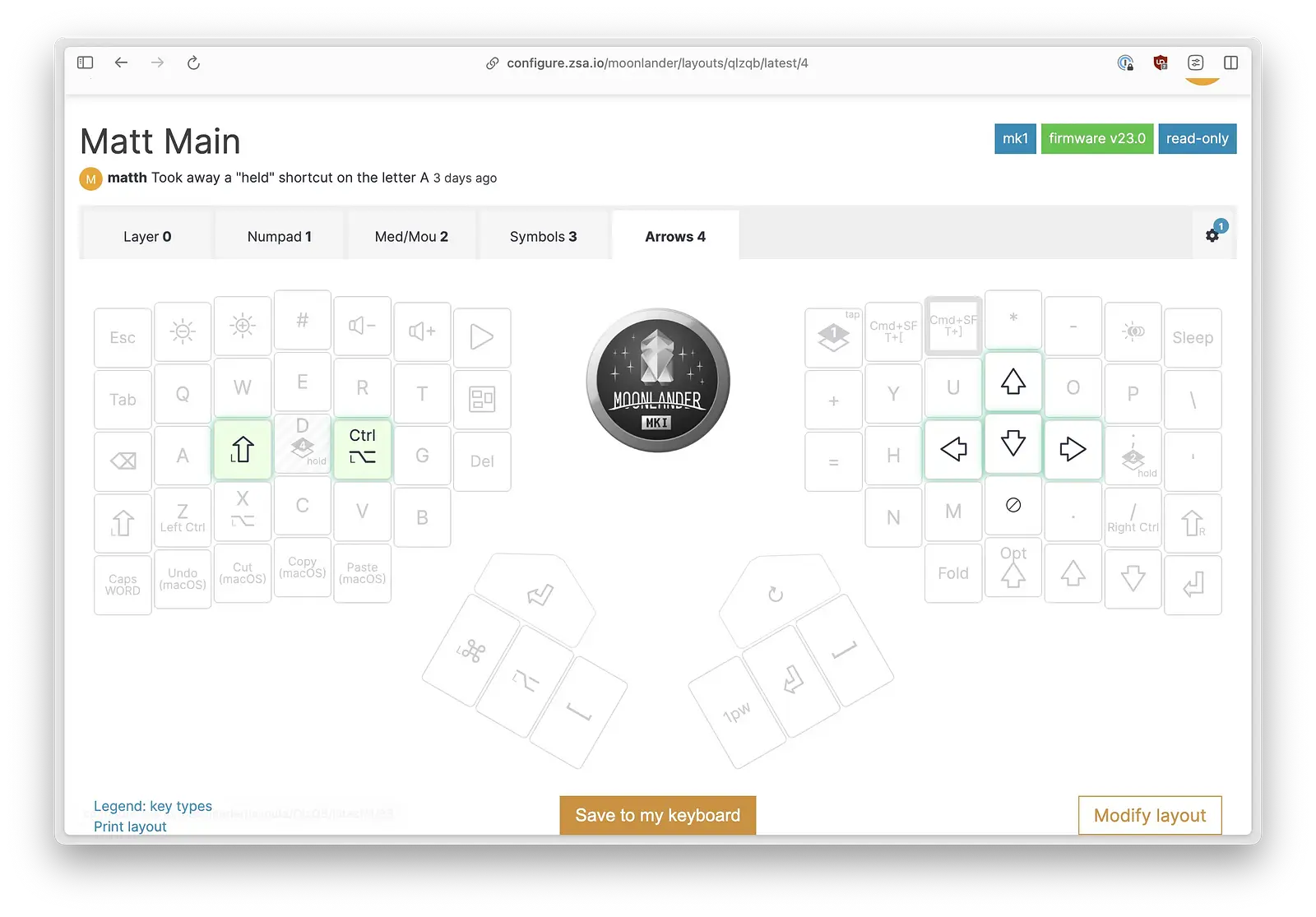
I use the keycap lights strategically. It may be tempting to opt for style, and some of the animations are very appealing, but I use colors as indicators. Function over form. The colors serve as "labels" for my keys. The following layer may look like a hot mess, but there's reasoning between the coloring decisions.
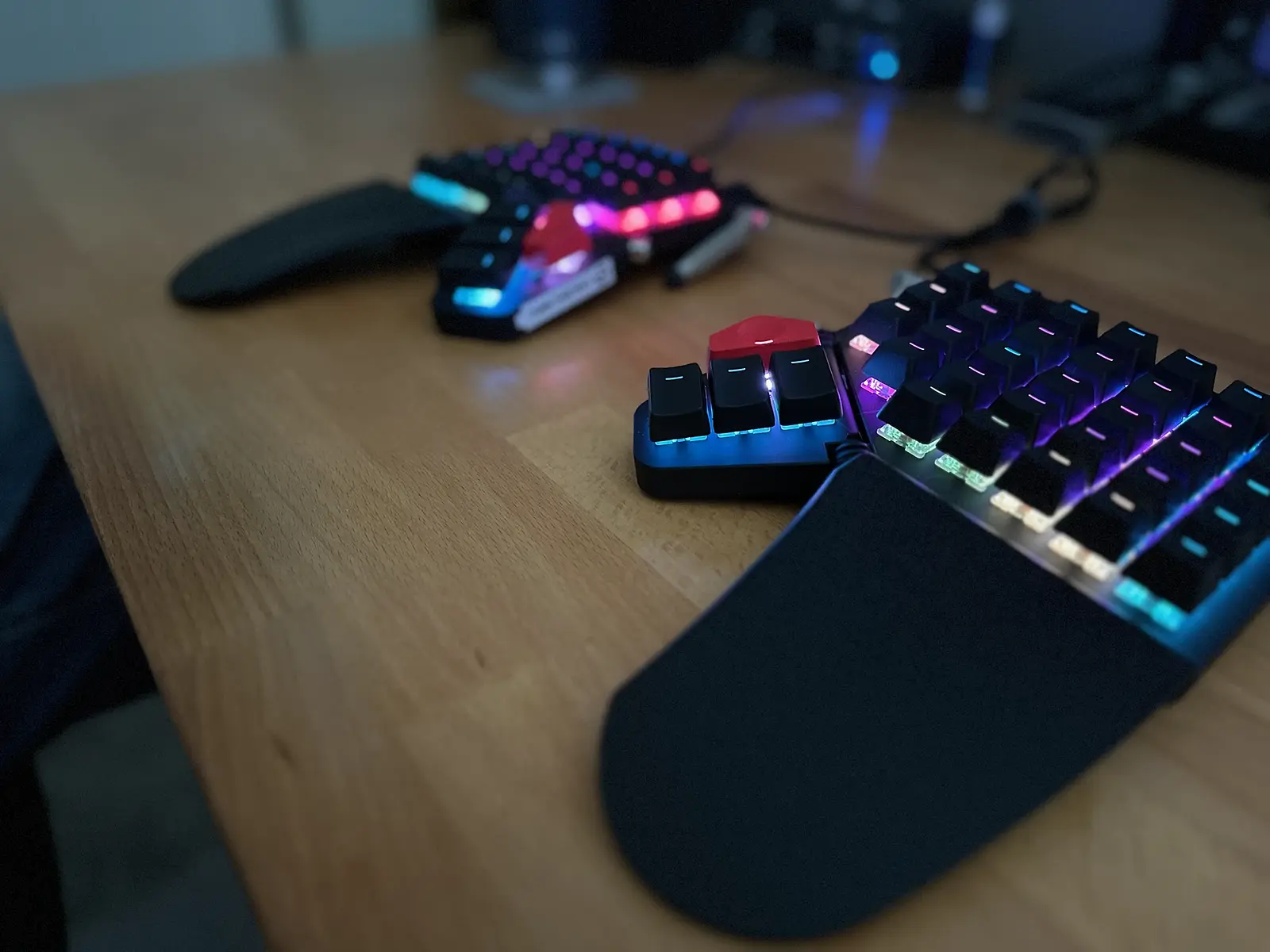
I won't spend the time to explain every decision, but you can make life a lot easier on yourself by giving meaning to your colors.
My layers
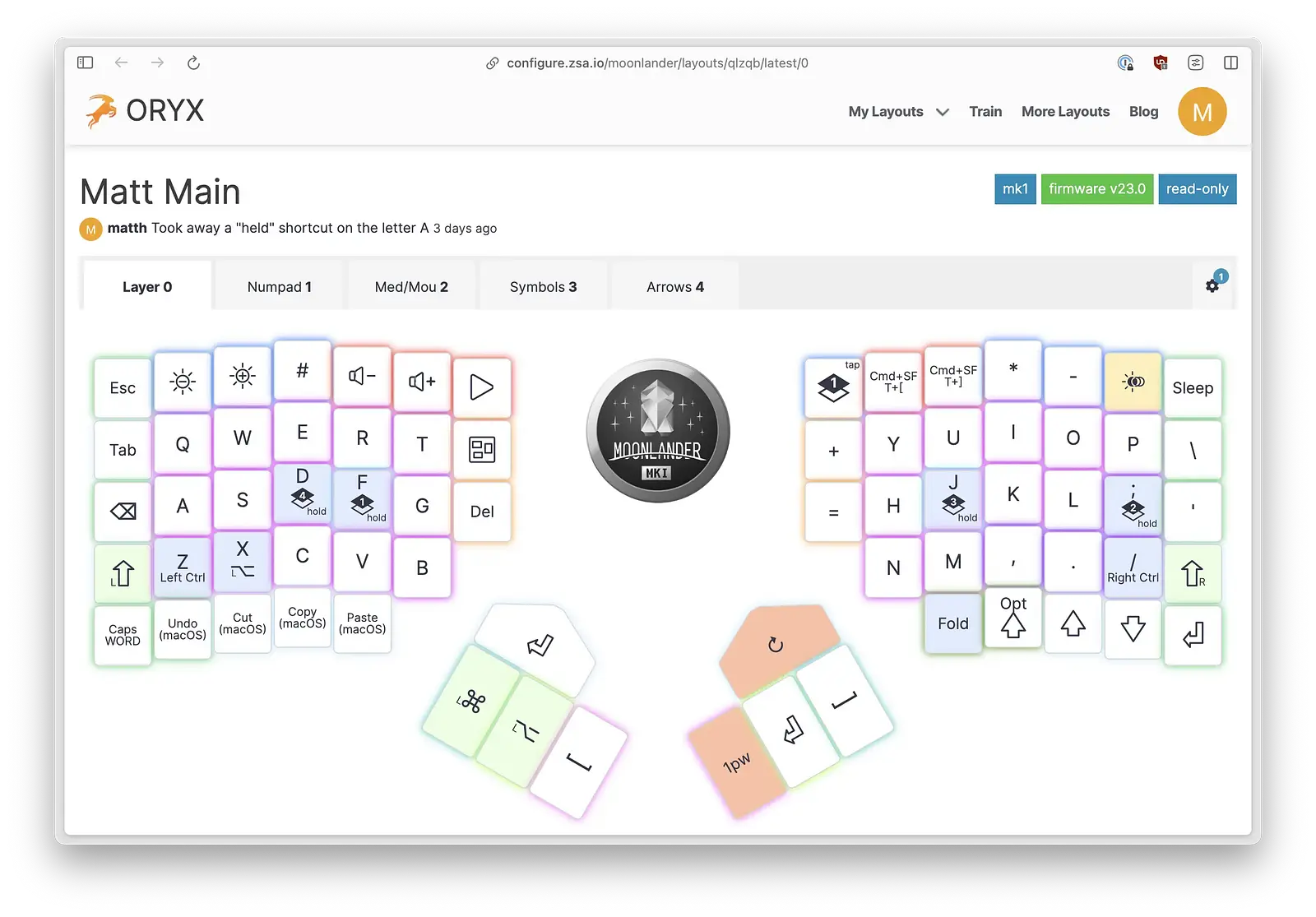
If you feel we share enough similarities, you could certainly mimic this layout scheme, but I promise you will make it your own. My very-high-level thinking process:
- Layer switching on the home row - if I hold down F, I get a number pad under my right hand right where it rests. If I hold down J, I get my symbols under my left hand. That's a ton of functionality with barely any movement on the keyboard. If I hold down D, I get arrow keys under my right hand. Again, no movements away from the home row.
- Backspace and delete - I didn't switch to Colemak, but I did love the idea of having backspace on the home row. I ended up putting delete on the same row, too. Now, the keys on either end of the row remove a character in their respective directions.
- One-shot shortcuts - deciding not to have a numbers row left me with a lot of room to assign keys to often-used shortcuts. I love having cut, copy, and paste as single keys. I love having file switching (⌘ + [, ⌘ + ]) as a single keys.
- Terminal keys - I'm in a terminal enough that I wanted a dedicated space for arrows and return for recalling previously issued commands (bottom right of layer 0).
I can't begin to tell you how little my hands move now. Once you no longer have to think about layer switching, it becomes so peaceful to type. Totally relaxed and centered where you need to be. No lifting your hands to get to the arrows or number pad. No rotating your wrists to make long reaches. Everything is where it should be.
Summary
The Moonlander is fantastic and didn't come with the learning curve I thought it would. In a couple of weeks, I achieved the efficiency I sought and felt great about the purchase. I absolutely love the ability to make the board do whatever I want, and I predict that will be the case for years to come. I had the majority of my layout tweaks done in the first several days, and the continued tweaks were mostly application-based, which is to be expected as you fire up the lesser-used apps.
I'd say pull the trigger if your primary concern is increased efficiency. If you have other considerations, then other reviews might be more helpful, as I haven't spent much time in mechanical keyboard land.
I can't believe I wrote this long of a post about a keyboard, but at least I had fun doing it on the Moonlander.
Wishlist
- Easier to find keycaps for customizing
- Tactile bumps on the thumb cluster
- Some reviews thought buttons like shift should be a bigger size. I would tend to agree, but you get used to it.
