Understanding SwiftUI's alignmentGuide
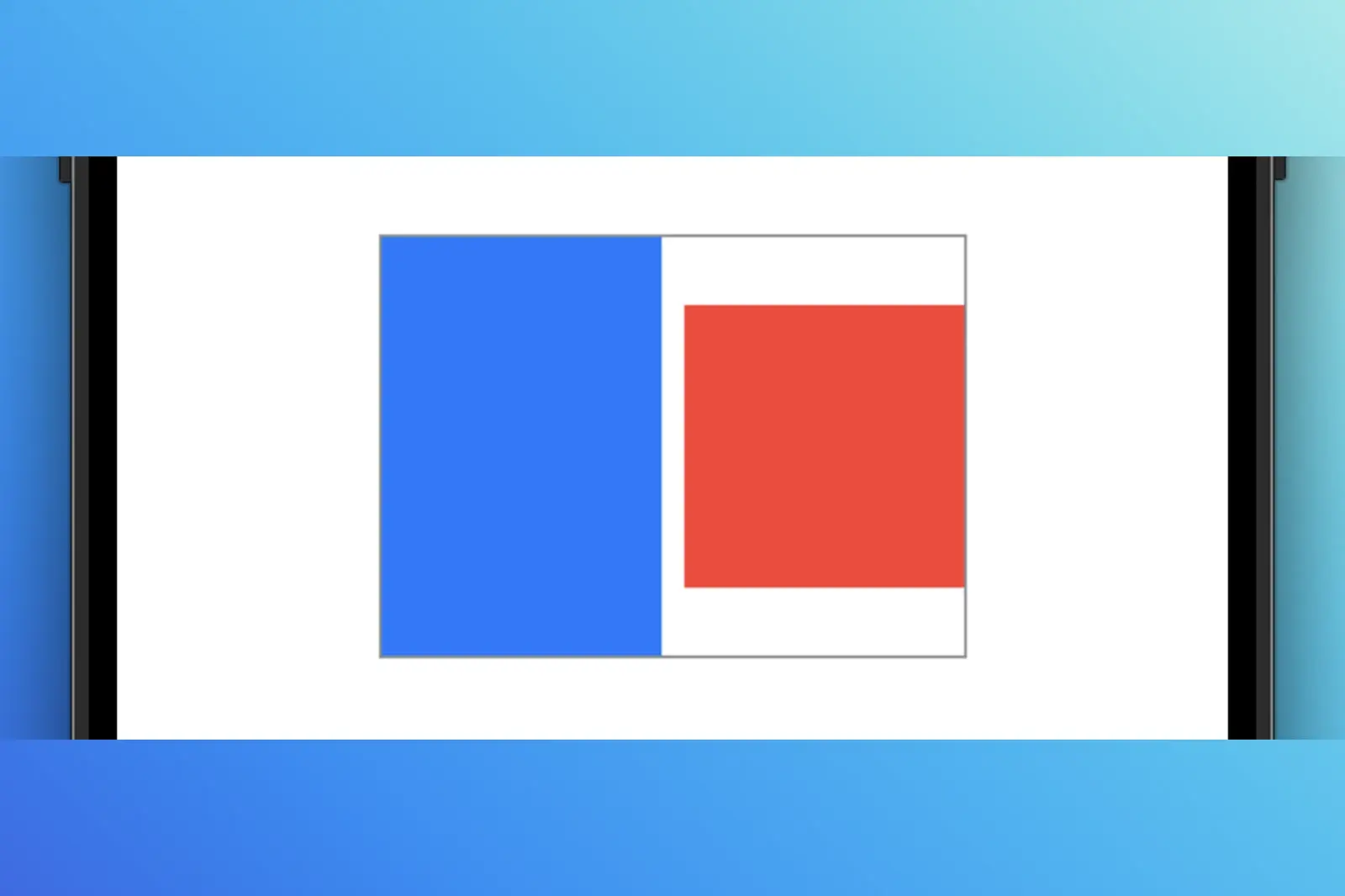
I'm nearing the end of 100 Days of SwiftUI, where Paul starts to discuss the alignmentGuide modifier, and the functionality seemed entirely backwards to me. Positive values along a particular axis seemed to move things in the negative direction. I spent waaaay too long trying to figure it out, and I don't want you to do the same so here we go.
I'm going to assume that you're somewhat familiar with alignmentGuide, but also having trouble understanding the direction your objects are moving. If you have no idea what any of this means, start here:
- Apple's documentation on
alignmentGuide - Alignment and alignment guides from 100 Days of SwiftUI
A basic example
Let's start with something you're probably familiar with, specifying the alignment in an HStack initializer:
// Code sample 1
HStack(alignment: .top) {
  Rectangle()
    .frame(width: 100, height: 150)
    .foregroundStyle(.blue)

  Rectangle()
    .frame(width: 100, height: 100)
    .foregroundStyle(.red)

}
.border(.gray)
This renders the following:
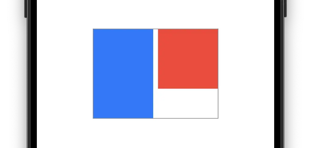
This part should make sense. We're creating two rectangles and telling the HStack they're embedded in that its contained elements should be aligned to the top of its bounds. Now, let's say that we need additional control over one of these rectangles. This is where alignmentGuide comes in.
Where it might get confusing
Let's slap on an alignmentGuide and try to push the blue rectangle down 25 pixels. To do that, you might try the following:
// Code sample 2
HStack(alignment: .top) {
  Rectangle()
    .frame(width: 100, height: 150)
    .foregroundStyle(.blue)
    .alignmentGuide(.top) { _ in
      25 // push it down 25 from the top, right?
    }

  Rectangle()
    .frame(width: 100, height: 100)
    .foregroundStyle(.red)
}
.border(.gray)
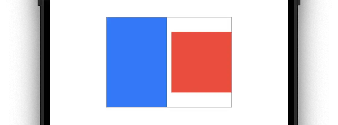
Huh? We return 25 and specify .top, but the blue rectangle appears to have moved up 🤔. That's strange. Shouldn't it push the blue rectangle down and away from the top of the HStack frame? All my years of web development and CSS had my brain treating it like margin-top. I don't know about you, but the above result seemed absolutely backward to me.
What's actually happening
I'm going to use some non-Swift terms to describe what is happening because the descriptions in the documentation made things unclear for me.
The thing to understand is that the HStack in the examples above aligns the orientation point of each rectangle to one another. Now, we're not dealing with actual orientation points here, but if you've ever done any motion graphics work (After Effects, 3D applications, Flash), you will likely be familiar with the concept. These applications allow you to specify a point the object will revolve around. The same thing happens here with alignmentGuide, albeit with a line on a specific plane. Let me illustrate it with some graphics.
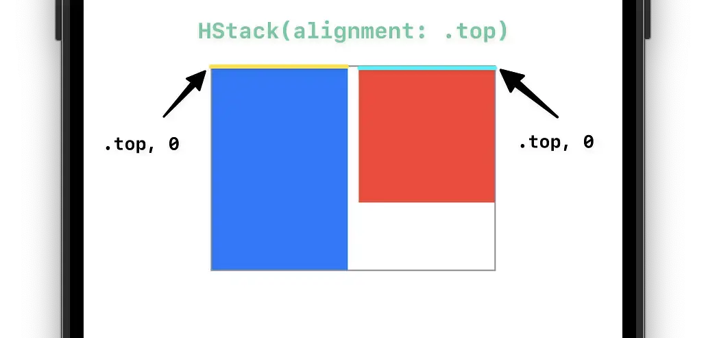
This represents code sample 1 under A Basic Example. We don't specify an alignmentGuide, so both rectangles have their alignment offsets pinned to the top of themselves. It's important to understand that the rectangles align with each other and not simply to the top of the HStack. If your breakthrough in understanding this has yet to hit, it's about to.
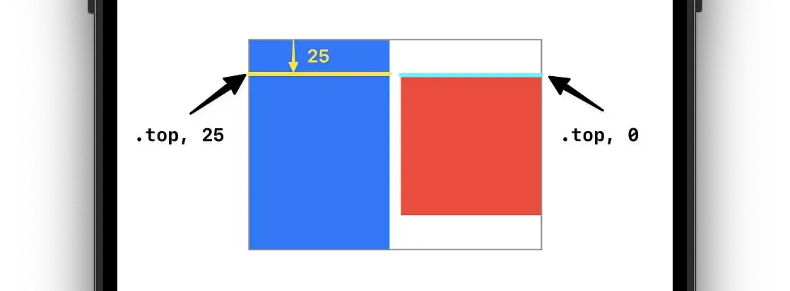
This graphic helps explain three essential things:
- The rectangles align to themselves, not the
HStack. - The rectangles align according to their alignment guides.
- The
HStackwill wrap its contents.
Using this modifier allows us to dial in where each rectangle alignment should occur. In the graphic above, we essentially say the "top" of the blue rectangle isn't the literal top; it's 25 pixels down. Please align it with the red rectangle at that location.
Make sense?
I hope that clears things up. When I first messed around with alignmentGuide, my brain was sort of working in CSS' box model mode and it was ultra confusing. It becomes clearer once you visualize moving around lines on the actual objects to get them to align.
