Cleaning up figures in Action Text
Action Text and Trix are great and give you an immense amount of power right out of the box. That being said, I didn’t like a bit of the styling for both the presentation of the figure to the user and in the editor. So let’s fix it!
ASSUMPTIONS
- You’re using Bootstrap 4
- You’re starting from a fresh install of Action Text
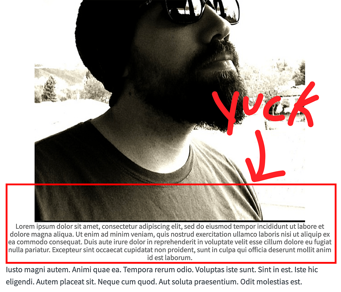
If you don’t touch anything and attempt to view an image with a caption you might get something like the following.

I think we can agree that this <figure> could look better. Center justified text is usually harder to read and we’ve got some issues with padding. Also, I wasn’t a big fan of the caption widening out further than the image itself.
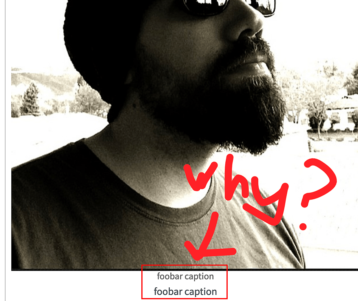
Additionally, when you are in the editor you get something like this.

It seems to be giving you a field you can edit while also displaying the caption as if you were viewing it on the frontend. Seems redundant to me. Okay, off we go.
CSS ADDITIONS
When you initialize Action Text, Rails is going to generate a scss file we can modify to our liking. The file in question is app/assets/stylesheets/actiontext.scss. We only need to make a few changes around the figure styling.
// app/assets/stylesheets/actiontext.scss
.trix-content {

  ...

  action-text-attachment {
    display: block;
    text-align: center;

    .attachment {
      padding: 0 !important;
      max-width: 100% !important;
    }
  }

  .figure-caption {
    display: flex;

    // A div we're going to add to the _blob.html.erb partial. This little trick
    // ensures the caption will never grow wider than the image above it.
    div {
      flex-grow: 1;
      width: 0;
    }
  }

  .attachment--preview {
    text-align: left;
    width: auto;
  }

  // Editor only. Hide the extra caption in the editor.
  .attachment__caption {
    display: none;
  }
}
HTML ADDITIONS
The html changes are minor. Similarly to the scss file Action Text generated on initiation, it generates a partial that can be modified. This file is app/views/active_storage/blobs/_blob.html.erb.
<figure class="figure attachment--<%= blob.representable? ? "preview" : "file" %> attachment--<%= blob.filename.extension %>">
    <% if blob.representable? %>
      <%= image_tag blob.representation(resize_to_limit: local_assigns[:in_gallery] ? [ 800, 600 ] : [ 1024, 768 ]), class: 'figure-img img-fluid' %>
    <% end %>

    <figcaption class="figure-caption">
      <div>
        <% if caption = blob.try(:caption) %>
          <%= caption %>
        <% else %>
          <span class="attachment__name"><%= blob.filename %></span>
          <span class="attachment__size"><%= number_to_human_size blob.byte_size %></span>
        <% end %>
      </div>
    </figcaption>
</figure>
We’re primarily focused on swapping out the existing css classes for the Bootstrap versions. We remove the .attachment class from the <figure> and swap it for the Bootstrap .figure class instead. We also add the classes .figure-img and .img-fluid to the <img>. We also swap the .attachment__caption class for .figure-caption on the <figcaption>.
Lastly, we drop a <div> inside the <figcaption> so we can properly set the width using some flexbox properties.
ALL DONE
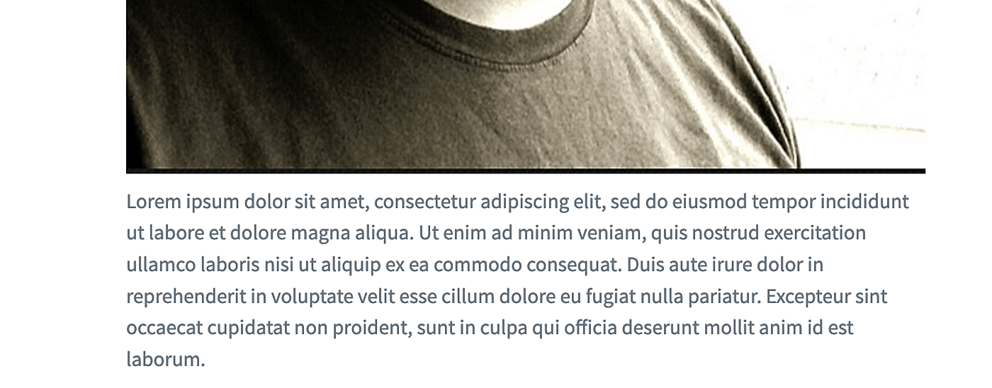
That’s it! You now have a figure that looks more like this.

I think it’s a vast improvement that is far more legible. It’s also nice and easy to implement. Enjoy!
